--- NOTE: This is a post that was lost a few months ago. It's back, ready for your review and comment. If you forgot the last
Designing Contest Visuals post,
read it here!
Bungie is a world-leading game development studio with an awarded mantle of games. The Halo series serves as the pinnacle of the company's accomplishments, but the design team has moved on to new ventures.
Destiny is the next title coming from these champions of entertainment, where the hope is to outdo even
Halo.
Bungie has been hosting
Destiny themed contests for most of this past summer. I've tried to be a steady competitor, so I'm here to talk a little about the design considerations used in submitting.
___________________________________________________________________________________
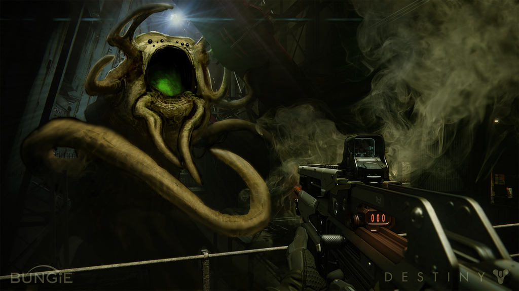
The second Bungie
Destiny challenge I submitted to was "
Your Worst Nightmare." Spoiler: My piece got a lot of backing.
Halo CE and
Halo 2 were both games that contained an element of horror that has never been emulated in Bungie's other titles (though
Halo 3 came close). Contest was asking for something nightmarish be put into one of their screenshots, so, if something terrifying was to be made with Bungie content, it's fitting to use something from the studio. Hence, I chose the slime, the green, the meat of the Flood.
A lifetime of playing, reading, viewing the designs of, and enjoying the universe of
Halo told me that tentacles and gooey are 'in' when in comes to terror. But, since time was short, the main form of the worm-like figure I needed was constructed by lassoing parts of an enemy character from
Halo 3 to give quick blocking and a free color-palette.
Having so much room to play in, the piece needed to have a flow - successful visual design will focus the eye to the primary point of interest and then guide the viewer to the rest of the picture. Curving appendages, the point of the firearm, and the angle of the overhead beams helped utilize the whole space.
A black maw next to the harsh light-source was chosen because it is a common (and almost required) technique to put the darkest darks next to the lightest lights. It is beneficial to add a bit of mystery into any concept, so the inner glow coming from deep inside the monster's gullet added a bit of dread. "I should be running in the other direction, but I want to know what that comes from" is something that any viewer should be asking themselves, especially in a video game horror scene.
The smoke from the firearm indicates that rounds were just fired, while the orange-glow barrel shows it must have been shooting for awhile. The "000" of an empty clip evokes a sense of hopelessness given that the viewer has thrown everything at the opposing beast, seemingly to no affect.
After getting feedback from fellow designers and honest friends alike, I must emphasize that a room's light-source needs to be reflected by all the objects in the room. Adding a color filter over the entire image removed a lot of the blue from the provided photograph, hence leaving the subject matter in a similar environment.
In my honest opinion, any artificial addition to a photo ought to interact with the environment in some way. Certain tentacles and the bottom recesses of the creature help suspend disbelief that the new subject does not belong. Then, equipping any digital object with a grainy texture (credit to
Dan LuVisi and his
tutorial) gives it a photo-realistic touch that saves hours and hours of rendering.
Finally, anything that I wanted the viewer to see first was kept saturated and lighted. A slight blur was added to the entire work but erased in areas that should show-off details. Next, the speed-lines actively draw an observer's gaze to the creature's face and provide a roadway back to it if the eye wanders.
All-in-all, I felt I really nailed the whole work. The lighting is there, the focus areas are appropriate, dread is evoked, and it was completed in a timely manner (approx. 8-10 hours over 2 days). The creature design is a little boring, but when taken into a game engine and put with an already gloomy area, this fits.
If you have questions or comments on why I did or didn't do something with this piece, I'd be very happy to address them. In the meantime, checkout the
piece and read more about the design
process. As to setting up how my Bungie submission got the backing it did to come out on top, well, that's for another time in explaining how to use social media.
___________________________________________________________________________________
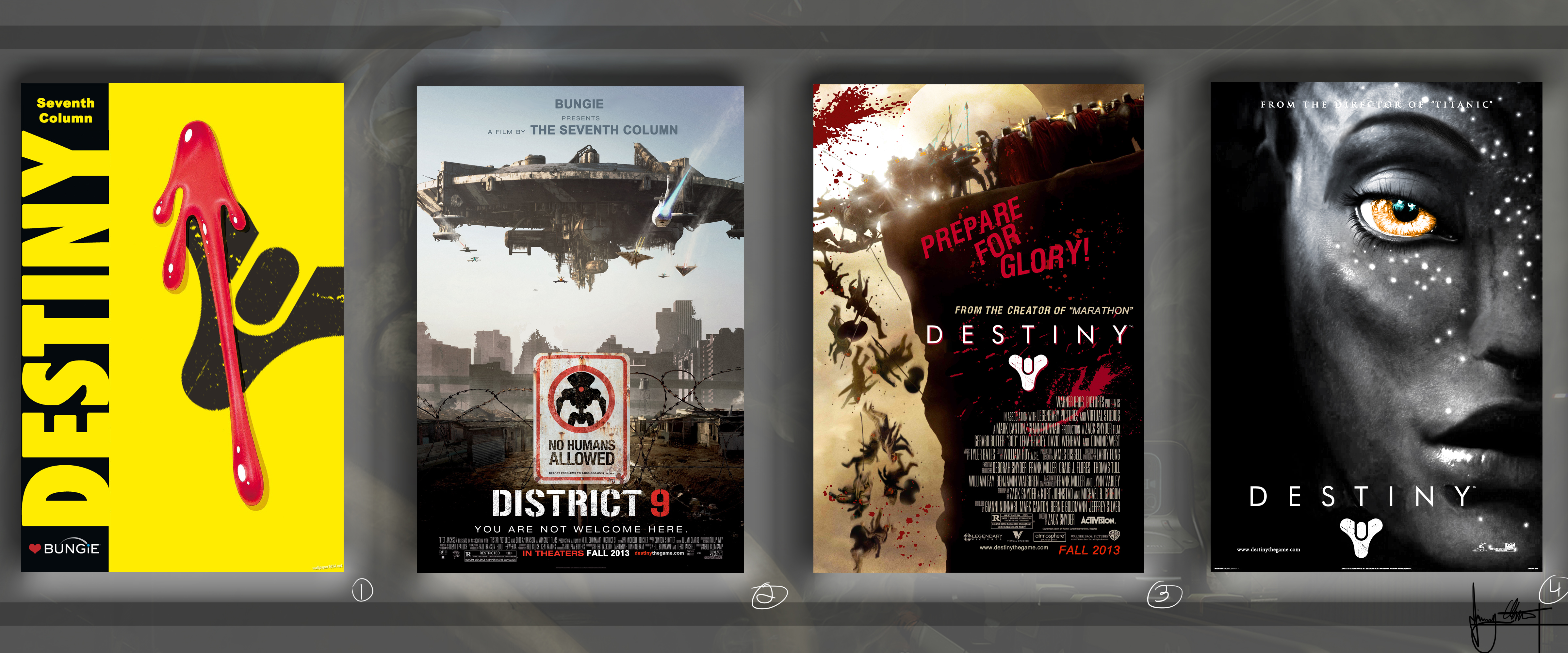
In the next round, a number of movie posters get a
Destiny twist of their own.


